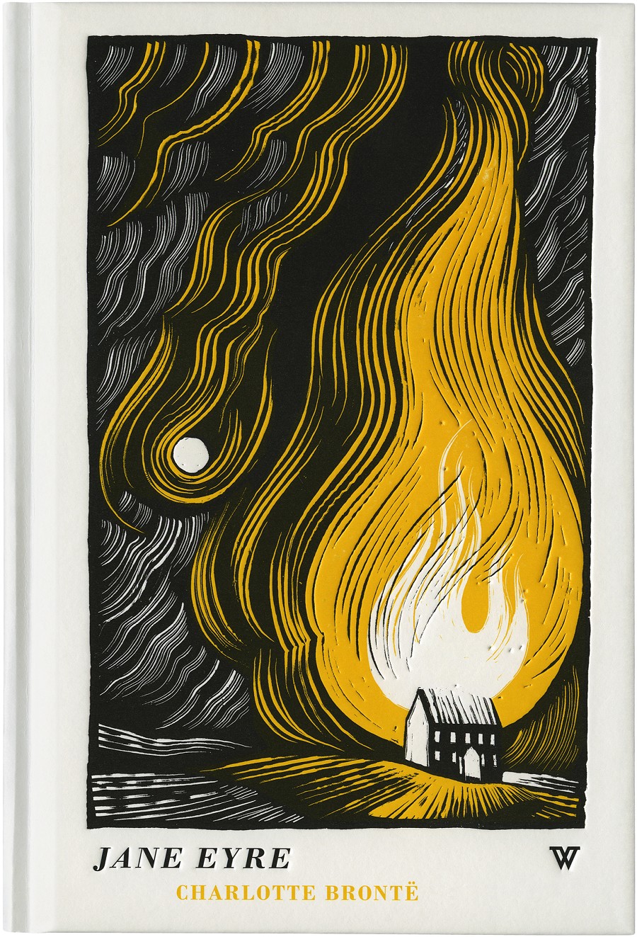
One of my all-time favourite illustrators, Joe McLaren,
has designed book covers for Hodder Headline and Portobello, while he
also produces handmade picture books. He has designed for a range of
gothic classics, including Jane Eyre and Wuthering Heights, and his
unique, colour-constrasting designs immediately caught my eye when
browsing a bookstore.


I
got in touch with him through email and he was nice enough to reply, to which I was very excited.
1: Due
to the recent rise in digital publishing do you think the physical
book is losing popularity?
In a
way, that's probably true, but I'd rephrase it. I think it isn't
losing popularity as much as it's losing proliferation. There will,
inevitably, be fewer physical books around in the future, but that
will mean that the ones that are produced will be more highly prized.
The same is true of the horse- there were far more horses around 100
years ago; it was the only way to move stuff around. There are now
far fewer horses, but those that are about are kept in relative
luxury and highly prized as expensive, desirable commodities. The
book, like the horse and the Polaroid camera will find a new, more
select audience more interested in essence than utility.
2: How does this affect your design? Does it influence your approach to designing the physical book?
Around
half of the commissions I receive for book cover design now are for
'luxury hardback' editions of previously published books. Typically
these will be bought as gifts, or by people who have a great fondness
for the book in question and want to dignify it with a special
purchase. Those commissions tend to revel in textures, materials and
processes associated with 'traditional' book design- foil printing,
registers, belly-bands etc; all of which fetishise the
book as an object, and none of which really serve the content in a
physical way. This suits me- I resonate with tradition, and find that
it often gives the greatest scope for playfulness in a subtle way. I
also understand the concept of wanting to house a precious book in a
precious case. That said, I reacted with initial hostility to the
appearance of the eBook- I have a house full of thousands of books,
and I suppose I felt in some way that I had an emotional investment
in physical literature that I didn't want to see threatened, but
that's nonsense. Ebooks are here to stay, and for the most part,
that's an excellent thing. More people will read more things, and
people can self-publish with far less difficulty and financial risk,
which I think is a fine thing. It may mean that book illustration as
an industry wanes, but then it always has waned and waxed- for
hundreds of years.
3: Would you find digital books more limiting to design for?
Yes,
and that's fine. It's a mistake to think of limitations on design as
a bad thing. My creativity is always excited most by a very
restrictive brief. An 'L' shaped illustration for an article about
incontinence that needs to be both amusing and sympathetic, and needs
to go to print at 3pm today is a far more demanding and exciting
brief to me than an illustration about 'love' with no direction that
can be done any time before Christmas. Where would you start? On the
other hand, any limitations imposed by digital books will be
outweighed by new freedoms and possibilities. I'm already having to
engage with briefs that demand illustrations that move slightly,
almost unnoticed. Imagine reading a horror story on an iPad late at
night, and suddenly the curtain in a small illustration which you've
barely looked at for the last three minutes flutters in the wind
quite unexpectedly- wonderful stuff!
4: In contrast to the digital copy, a book is 3D. Do you use this to your advantage in your design?
It's
always a consideration- particularly in the field of luxury
hardbacks. If you want customers to choose such a book over an eBook,
then you need to play up all the things which an eBook can't offer-
the paper needs to smell good, the cover can be
debossed and foiled, it should crack open satisfyingly when you first
open it. Having said that, I think a Kindle is an equally nourishing
thing aesthetically.
5: Are you interested in the gothic genre of literature? Do you find it an interesting genre to design for?
It
certainly chimes with my personal tastes- I have a great appetite for
horror and anything Victorian in particular. In a way it can be very
difficult to illustrate for something you already feel very attached
to. I'm currently illustrating covers for a series of fantasy books
I've loved since childhood and it's tremendously difficult to
actually make decisions and self-edit with material that feels so
close to you, in much the same way that it's easier to draw a
caricature of your teacher than of yourself- you've lost the
necessary objectivity needed to simplify the information.
6: Do you think your individual techniques and the medium you use compliment the Gothic genre?
I
often play with imagery and techniques which reference the past, and
I often use techniques which necessarily produce stark contrast of
light and darkness- all of which finds sympathy in Gothic literature
I suppose.
7: How do you transfer your illustrations to a graphical format? Do you think any effect is lost through this?
I
always start a piece of work with the final product in mind. Drawings
and other physical artwork do lose something when scanned into a
computer, but they gain something new at the other end of the
process. I typically use scraperboard, which gives high contrast and
very clear lines. Digitising the image actually serves to improve
those qualities. There is something more intangible lost when you
make a physical object into a digital file, but illustration is
concerned with communication and the image itself, not the
preciousness of the original- that's a concept that belongs to fine
art.
8: Does designing a cover for a classic book have its drawbacks?
You
have a set of presumptions to counter, but the advantages outweigh
this- you can be more oblique and playful with a book everyone thinks
they know.
9: How do you use your design to interest the modern audience in a classic book?
The
challenge is to interpret something very familiar and established for
an audience who is familiar with it. I try and find some aspect of
the atmosphere of the book, and hint at the story obliquely, which
flatters a certain audience I think.
10: Do you always read the book you're designing for?
Yes,
whenever the manuscript is available. Very occasionally the book is
unfinished when I create the cover. I usually find an unabridged
audiobook, which means I can get through it while running or washing
up. I also use a computer programme which converts PDF manuscripts
into audiobooks. These sound a bit robotic as you might imagine, but
I simply wouldn't have time to get through every book for every cover
otherwise. I would hate to be an author and to think that the person
who is going to represent my life's work to the customer hasn't even
bothered to read it himself.
11: Do you have an agent who helps you find work for book design?
No,
not at the moment. I get work through word of mouth, and from people
who have seen other covers I have done.
12: Wuthering Heights and Jane Eyre are a very famous stories. Did you find it difficult to break the expectations people could have of these books and how their design should look? How did this affect your design?
Other
than bearing in mind that the audience will have a level of
familiarity with the title, if not the story, I find it best to treat
illustrating them like any other book. Trying to respond in some way
to hundreds of years of established ideas about those books would be
impossible- better to ignore it, and hope that works!
---
I have highlighted sections that deal particularly with the physical book and the ebook. I found Joe McLaren's insight extremely interesting. He made it clear that, to make the most of the physical book, designers should revel in textures: "foil printing,
registers, belly-bands etc; all of which fetishise the
book as an object, and none of which really serve the content in a
physical way", while he also said that ebooks were not necessarily a bad thing, as they encourage more people to read.
No comments:
Post a Comment