1: Due to the recent rise in digital publishing do you think the physical book is losing popularity?
Not
in children's books. We talk about this a lot. Oddly it seems to make
publishers far more aware of what makes a physical book appealing,
and they have been pushing some books down the tactile route with
some higher production value books. So for example, look at what
Templar is doing with its 'Ology' series, which are books very much
celebrating the nineteenth century compendiums, using hardback
boards, with foils, spot varnishes, jewel encrusted covers and a high
illustrations to text ratio. Also a number or publishers have
released sort of 'collectors items' books, so high production,
expensive retellings of classic stories (again, Templar are masters
at this, see Dracula). At the same time these publishers have been
using multimedia to promote and augment these books. Templar again
provide good examples, the Ology series has a strong online
commitment, and the books themselves have been quite groundbreaking
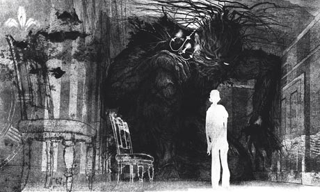
in using 'augmented reality' software (see Dragonology). A Monster
Calls was very much designed as a physical object, but was promoted
online using animated commercials.
2: How does this affect your design? Does it influence your approach to designing the physical book?
It
does effect your design, because it is instrumental in your efforts
to do the text justice. You want to complement the story to the best
of your abilities in the format you are commissioned to illustrate
in. You have to get a handle on the format before you can start, as
you need to know the limitations of the mechanics of the book, and of
the printing methods being employed.
3: Would you find the front cover of a digital book more limiting to design for?
Not
really, in fact there would be far fewer problems because a digital
book is backlit, and this would do my darker illustrations far more
justice than the printed versions. A Monster Calls has been a bit of
a headache for a number of publishers, getting the dark tones
correct. I get a bit peeved when publishers see a dark illustration
and immediately turn up the contrast so they can see
everything....some things aren't meant to be seen!
4: In contrast to the digital copy, a book is 3D. Do you use this to your advantage in your design?
Yes,
there is definitely a conscious decision about the design of a
tactile object. The art director is hugely important at this stage. A
lot of A Monster Calls design and appearance is down to Ben Norland,
who is a brilliant art director.
5: Are you interested in the Gothic genre of literature? Is it an interesting genre to design for?
I
suffer from bipolar disorder, which has been life changing, and
looking back I think it made me search for stories that addressed the
darker aspects of the human condition. The gothic genre is quite a
broad spectrum, but certainly I'd say many of my favourite yarns,
films, music, artworks would fall within its shades. It was mostly
because I felt that the cheerful boys adventure stories just had no
connection to my experiences. Same with music, I tend to gravitate to
things that deal with the darker, grubbier side of the human
condition. I hated most of the pop music my friends listened to in
the sixth form. As someone once sang "It says nothing to me
about my life".
6: Do you think your individual techniques and the medium you use compliment the Gothic genre?
I tend
to change technique to fit the brief....believe me I have done some
pretty saccharine stuff before for people like mothercare. I do
however, tend to think in black and white, which helps. I think it's
all about what you don't see, than what you do. If you look at Ridley
Scott's first Alien film, you hardly see the alien, which makes it
more frightening than the later versions when they are fully rendered
in CG. When I was young I was really influenced by the artist Ian
Miller, who you should check out, he's now a good friend of mine. I
was also influenced by the Czech animator Jan Svankmajer, in
particular his film Alice, which is amazing
7: How do you transfer your hand-drawn illustrations to a graphical format? Do you think any effect is lost through this?
Do you mean how do I go from drawing board to screen? Well scanning, and yes, you inevitably lose something.
8: Do you have an agent who helps you find work for book design?
Yes, she is amazing. More importantly she has become a good friend and hugely supportive, which is vital for a business that can be very solitary. Her name is Alison Eldred, she is extremely well connected as she used to run Arena. She is sort of semi retired now.
----
I pleased I decided to interview Jim Kay - not only because he was friendly and helpful and provided some great insight - but also because it was interesting to see the perspective of a children's book designer. I found it particularly interesting to find out that the colours of a digital book would actually compliment Kay's design more. However, he did mention the same thing that Joe McLaren did: "Oddly it seems to make publishers far more aware of what makes a physical book appealing, and they have been pushing some books down the tactile route with some higher production value books."


No comments:
Post a Comment