Monday 20 January 2014

Classic Redesigns (2)

Tom Gauld
I next looked at Tom Gauld, a cartoonist and illustrator, who was commissioned to design a cover for the novel The Three Musketeers. Gauld works with his strengths in this design, for he uses a lot of humour throughout. Like Daniel Clowes, who produced the comic Franketenstein cover, Gauld's comic style brings something truly unique to the design, something that you wouldn't expect to see on a classic novel. Yet this is what makes it stand out. Again, this cover could broaden the readership of classic literature.


Jillian Tamaki

I next viewed work from Jillian Tamaki, an illustrator and cartoonist, wh specialises in textiles and embroidery. She was also commissioned to design a number of covers for classical novels, such as Emma, Black Beauty and The Secret Garden, which she did through embroidery. A textile approach to a book cover is unusual, so I found this very interesting to look at. Her delicate, feminine style is  translated across to these books, which, I personally think, works very well alongside classic literature. The colours she has used also make the books stand out and lends them an extra appeal.

Work in progress:

References:
http://jilliantamaki.com/embroidery-textiles/penguin-threads/
http://www.tomgauld.com/index.php?/portfolio/the-three-musketeers/

Classic Redesigns (1)

I was also interested in classic redesigns, as this linked to what I would like to create for my final piece. I therefore decided to look more into how current designers and illustrators use the cover as a method to pull these classic novels into the 21st century. By making the cover look more modern, less dry and more interesting, this opens up the book to a wider audience, perhaps interesting those who wouldn't have been interested in classic literature previously. I therefore looked at some artists who redesigned classic literature books in a very modern and unique way.


Daniel Clowes
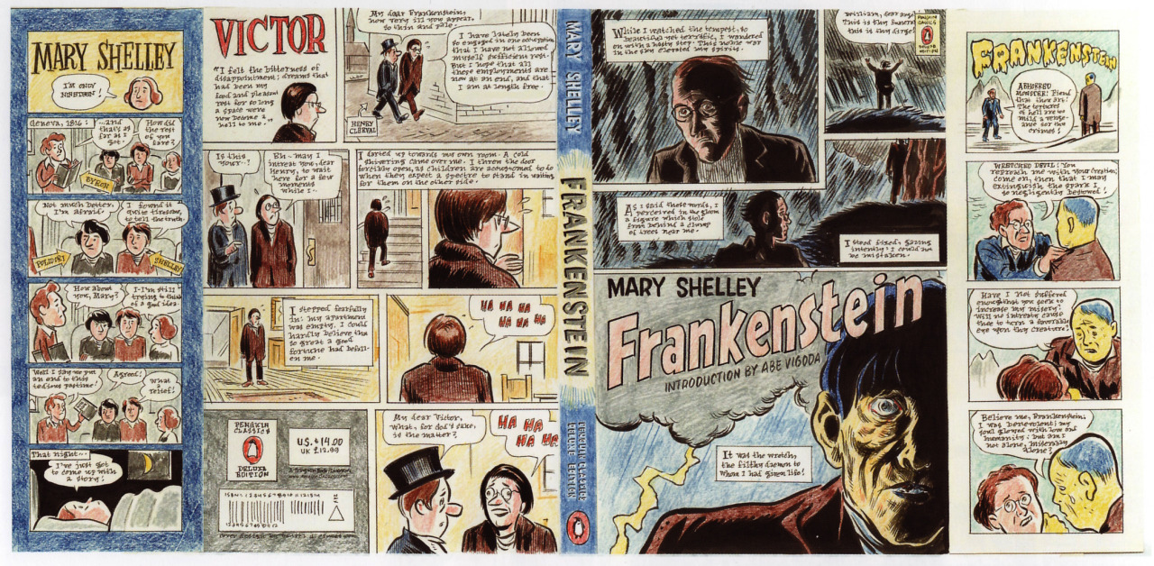
I first looked at artist Daniel Clowes, who is an American cartoonist and screen-writer, most well-known for his comic books Ghost World and Eightball. Clowes was commissioned by Penguin in 2007, along with two other comic artists, to produce a redesign of Frankenstein in his usual comic style.
This is a definite twist on a classic book and something you don't expect to see - a novel with a cartoon-strip as its cover. I think this originality is what makes the novel so effective and it will definitely grab the viewer's attention when it is sitting on a book shelf. Clowes' unsettling, angst-filled style also transfers and matches wonderfully to this Mary Shelley novel.

This comic book appearance would perhaps interest a wider audience, those who wouldn't have thought to read a classic novel. The comic style also encourages a younger audience, possibly children, to pick up and read a classic book.

Clowes' draft of book cover:

The design also makes use of the book's physicality by including images and narration on the flaps of the book jacket, which would be seen inside the book. The 'about the author' flap is also revamped with a comic-style appearance. Instead of a block of text, which is what is typically seen, the illustrator creates a comic about her background information, keeping in style of the rest of the book cover.

The front flap portrays a scene between Frankenstein and his monster.


Ruben Toledo
I next looked at Ruben Toledo who is a fashion illustrator known for his colourful, bright and theatrical images. He has designed mannequins, store windows, scarves, fabrics, carpets, album covers and murals. This artist brings a unique characterisation that somehow lends itself perfectly to classic literature, especially the gothic novels. When you look at the human characters in his designs, you can tell that they have been influenced by a fashion illustration background, which, with their sharp edges, translates wonderfully over to gothic literature. He also creates very strong, balanced compositions.

The Gothic inspiration is very much present in this book cover. A lost girl stars out at the viewer while a intimating mansion stretches beyond her. The cool blue colours, contrasted with one splash of blood red, add a chill to the illustration. 
Darcy and Elizabeth pass each other disdainfully, though cannot help but glancing back at each other. The silhouetted figures and starkly contrasting monochrome colours really make this cover stand out. 
Strong colours grab the attention of the viewer and bring the book to life.
It says on US penguin group, "Each luxury volume features French flaps, rough front, and specially designed covers in oil, watercolor or pencil."
Both these illustrators/designers but a unique twist on a classic book, which interests new and old audiences.


References:
http://frankensteinia.blogspot.co.uk/2010/10/covers-of-frankenstein-daniel-clowes.html
http://theotheradamford.wordpress.com/2009/12/09/seriously-the-best-book-covers-ever-bar-none/
http://www.us.penguingroup.com/pages/classics/ruben_toledo.html
http://artnectar.com/2011/04/book-cover-design-penguin-classics-illustrated-fashion-illustrator-ruben-toledo/
http://intheravenswood.blogspot.co.uk/2011/03/ruben-toledo-for-penguin-deluxe.html

Neil Gaiman: The Ocean At The End Of The Lane


A recent new story from author Neil Gaiman has inspired a limited edition cover, designed and illustrated by Dave McKean, which will only see 2,000 printed copies. Keeping in tradition with book designs for 'special', limited-edition books, McKean makes full use of the book's physicality. The book is 'deluxe hardcover' with a die-cut silk-bound slipcase, beautifully designed endpapers, while the text is printed on heavy-stock matte paper. This was revealed to me on Chip Kidd's website.
The book's case adds an extra element to the design, playing on shape and texture. It would have been interesting to see hidden images, however, once you remove the case, images that had lain in wait under it. But the cover is still beautiful even when the case is removed. The case adds a fun element and makes the book look more like a treasured, high-end item.

McKean also illustrated high-quality and full-colour images for the inside of the book. This was interesting to view, as it is unusual for a book to contain illustrations, especially coloured, intricate ones such as this. This only adds to the book's appeal and quality.

With books like these being released it only confirms how sought after quality physical books are becoming, for this limited edition copy was sold out very quickly.


References:
http://chipkidd.com/journal/?p=3479
http://www.tor.com/blogs/2012/12/dave-mckean-reveals-artwork-for-neil-gaimans-the-ocean-at-the-end-of-the-lane
http://subterraneanpress.com/store/product_detail/the_ocean_at_the_end_of_the_lane

Saturday 4 January 2014

Another Waterstone's Visit

During another trip to Waterstones, I noticed that there seemed to be more 'luxury' books than ever. For I found numerous hard-backed, special-edition book covers (some examples seen above) when browsing the store. In interviewing numerous graphic designers and illustrators, I found that many of them had explained that they thought the physical book was beginning to be seen as a more special and treasured thing, which is made obvious through new styles of book covers, and I think that this definitely confirms that theory.

The physical book is becoming more special and treasured, like a collector's item. With the rise of ebooks, I think that designers are trying to think of new ways about what would make a person now buy the physical copy and this is the working solution they have came up with. In this case, I actually think this could be a great step forward in design, for book covers are now being treated with the utmost care to make sure that they are beautiful and wanted. As a result, more aesthetically-pleasing book covers are being produced and a number of techniques (such as experimentation with textures etc.) explored to highlight their physicality and increase their beauty.

In my interview with him, Joe McLaren, I think, called it perfectly: "Around half of the commissions I receive for book cover design now are for 'luxury hardback' editions of previously published books. Typically these will be bought as gifts, or by people who have a great fondness for the book in question and want to dignify it with a special purchase. Those commissions tend to revel in textures, materials and processes associated with 'traditional' book design- foil printing, registers, belly-bands etc;  all of which fetishise the book as an object, and none of which really serve the content in a physical way."