When I visited the London book fair, I noticed that books with "special features" where certainly gaining in popularity. Though the books I viewed were aimed at a younger audience than my teenage and adult target audience, there was still a definite presence of making use of the physical aspects of the book. This involved texture, flaps, sound and more.
It was interesting to view these leading books and note on their physical aspects. It proved to me that designers are more likely to be experimenting with making the physical book more interesting and playful.
Monday, 28 April 2014
Saturday, 19 April 2014
Book Cover Flaps
I discovered these books while browsing Waterstones. Both were displayed on a bookshelf, facing outward, meaning that their "extra features" could be seen and the viewer could experiment with these unusual book covers.
"My Notorious Life" shows a glimpse of an image - a woman walking away - through the keyhole on the front cover. The viewer can unfold this page to reveal the full image.
This book is very similar in technique. In my opinion, it causes the book to stand out on the shelf, as it gives depth to the image, this added 3D quality. Underneath this front cover lies the glimpsed image adjoined with reviews of the book, which encourage the viewer to read further.
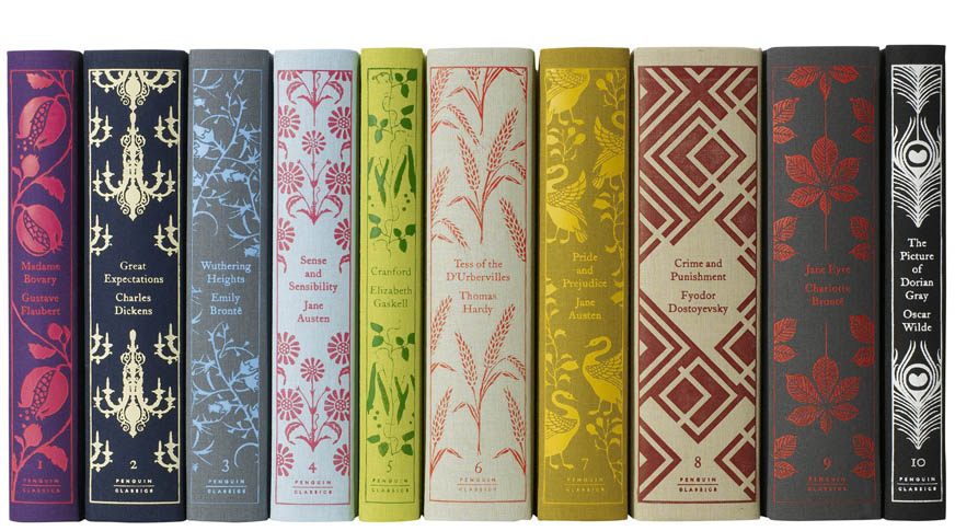
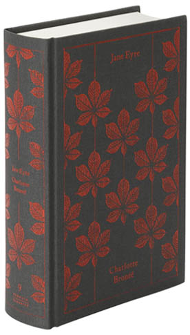
Penguin Classic Redesigns
By Coralie Bickford-Smith. She writes:
"These titles explore my obsession to create beautiful, timeless artefacts for people to enjoy, cherish and pass on. Sumptuous, tactile books that evoke a rich heritage of bookbinding while retaining fresh appeal to modern readers; that both stand out in bookshops and have a longevity appropriate to the contents."
Hardcover editions. Special, luxury books.
I have noticed this new trend of redesigning classic books in various bookstores. Many books contain repeating mortifies, which reflect the content - be it obvious or metaphorical - of the books.
She typically uses only two colours. These are complimentary colours, typically picked to reflect the mood and content of the books she designs for.
References:
http://cb-smith.com/
http://www.us.penguingroup.com/static/pages/classics/hardcoverclassics/index.html
Thursday, 17 April 2014
Idea development
Dracula development

- Moon changed to white - more complimentary to the rest of the image.
- How the front cover will look with the image behind.
- Monster intimidating, overshadowing victim with cross.
- Behind front cover.
- Gothic scene.
- Able to see cross and part of the hand.
- Silhouettes - not overwhelming in detail - doesn't take away from the front cover.
- Wrinkles and creases removed using Photoshop. Much neater. Edges of gravestones sharpened.
- Monochrome colour scheme (to go with gothic, light vs. dark theme of the book) with a pop of dark red colour (blood).
- Modern typeography to attract a new audience to the reader, though with a hint of the traditional, with the ink-like typeface.
- Spine is simplistic, clean. Imagery of the moon carried on here.
- Blurb inside the cover.
- Moon theme carried over.
- "Supernova" typography again included.
- Blurb written in Baskerville Old type - traditional, gothic.
- Development. Neater, fuller crescent moon.
- Text - squatter. More compact. Gives the appearance of taking up more of the space.
- Typeface changed. I felt that this script, ink-like font worked better for the Dracula narrative. It replicates someone taking up a diary to write.
The Hound of the Baskervilles development
- To go behind front page.- Textured hound - adds more depth, interest to illustration.
- "Clues" to go alongside image of hound - footsteps, pawprints, butterflies. These link to the content of the story.
- Hound appears sinister, lurking behind the page.
- Magnifying glasses on front page.
- Similar theme as the Dracula book - consistency, to show it's part of the same redesign.
- Yellow - stands out against the grey.
- Magnifying glass (and clue pawprint) carried onto the spine.
- Magnifying glasses cut out. Able to see parts of the hound illustration beneath. Element of under covering clues - links to story.
Displaying books
- Classic literature book shelf display at Waterstones.
- There are numerous repeats of these books, those of different editions and book covers.
- Dracula has a Waterstones recommendation. A book cover faces out, so the viewer can see the front.
- The spines can only be seen on the other versions of Dracula. These spines, however, do stand out, especially the first from the left, which contains a recognizable illustration of Dracula.
- Lots of books are also displayed on low tables. These are usually the books that are on offer - or new editions. For example, the photograph above shows a selection of classic literature, such as Frankenstein and Dracula. If my book covers were to go into a book shop, this would also be an option for how they would be displayed.
- Books that hold physical extra features, like my book cover will, have be presented facing outward. This means that the viewer can play with them while they are on the shelf, opening the covers to see the special features.
I also visited other shops, such as second-hand bookstores and The Works. Books in The Works were more likely to be displayed on tables, showing their front cover, or on shelfs, facing outward, again showing their front cover.
Second-hand bookstores meanwhile mostly showed on the spine in bookcases.
Subscribe to:
Comments (Atom)


