Thursday, 31 October 2013

Interview with Jim Kay

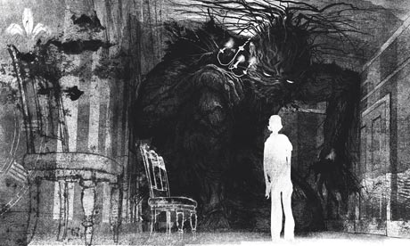
Jim Kay is an illustrator who has produced wonderful mainly black-and-white designs for children's books, such as The Monster Calls. 


1: Due to the recent rise in digital publishing do you think the physical book is losing popularity?

Not in children's books. We talk about this a lot. Oddly it seems to make publishers far more aware of what makes a physical book appealing, and they have been pushing some books down the tactile route with some higher production value books. So for example, look at what Templar is doing with its 'Ology' series, which are books very much celebrating the nineteenth century compendiums, using hardback boards, with foils, spot varnishes, jewel encrusted covers and a high illustrations to text ratio. Also a number or publishers have released sort of 'collectors items' books, so high production, expensive retellings of classic stories (again, Templar are masters at this, see Dracula). At the same time these publishers have been using multimedia to promote and augment these books. Templar again provide good examples, the Ology series has a strong online commitment, and the books themselves have been quite groundbreaking in using 'augmented reality' software (see Dragonology). A Monster Calls was very much designed as a physical object, but was promoted online using animated commercials.

2: How does this affect your design? Does it influence your approach to designing the physical book?

It does effect your design, because it is instrumental in your efforts to do the text justice. You want to complement the story to the best of your abilities in the format you are commissioned to illustrate in. You have to get a handle on the format before you can start, as you need to know the limitations of the mechanics of the book, and of the printing methods being employed.

3: Would you find the front cover of a digital book more limiting to design for?

Not really, in fact there would be far fewer problems because a digital book is backlit, and this would do my darker illustrations far more justice than the printed versions. A Monster Calls has been a bit of a headache for a number of publishers, getting the dark tones correct. I get a bit peeved when publishers see a dark illustration and immediately turn up the contrast so they can see everything....some things aren't meant to be seen!

4: In contrast to the digital copy, a book is 3D. Do you use this to your advantage in your design?

Yes, there is definitely a conscious decision about the design of a tactile object. The art director is hugely important at this stage. A lot of A Monster Calls design and appearance is down to Ben Norland, who is a brilliant art director.


5: Are you interested in the Gothic genre of literature? Is it an interesting genre to design for?

I suffer from bipolar disorder, which has been life changing, and looking back I think it made me search for stories that addressed the darker aspects of the human condition. The gothic genre is quite a broad spectrum, but certainly I'd say many of my favourite yarns, films, music, artworks would fall within its shades. It was mostly because I felt that the cheerful boys adventure stories just had no connection to my experiences. Same with music, I tend to gravitate to things that deal  with the darker, grubbier side of the human condition. I hated most of the pop music my friends listened to in the sixth form. As someone once sang "It says nothing to me about my life".

6: Do you think your individual techniques and the medium you use compliment the Gothic genre?

I tend to change technique to fit the brief....believe me I have done some pretty saccharine stuff before for people like mothercare. I do however, tend to think in black and white, which helps. I think it's all about what you don't see, than what you do. If you look at Ridley Scott's first Alien film, you hardly see the alien, which makes it more frightening than the later versions when they are fully rendered in CG. When I was young I was really influenced by the artist Ian Miller, who you should check out, he's now a good friend of mine. I was also influenced by the Czech animator Jan Svankmajer, in particular his film Alice, which is amazing


7: How do you transfer your hand-drawn illustrations to a graphical format? Do you think any effect is lost through this?

Do you mean how do I go from drawing board to screen? Well scanning, and yes, you inevitably lose something. 

8: Do you have an agent who helps you find work for book design?
Yes, she is amazing. More importantly she has become a good friend and hugely supportive, which is vital for a business that can be very solitary. Her name is Alison Eldred, she is extremely well connected as she used to run Arena. She is sort of semi retired now.


----

I pleased I decided to interview Jim Kay - not only because he was friendly and helpful and provided some great insight - but also because it was interesting to see the perspective of a children's book designer.  I found it particularly interesting to find out that the colours of a digital book would actually compliment Kay's design more. However, he did mention the same thing that Joe McLaren did: "Oddly it seems to make publishers far more aware of what makes a physical book appealing, and they have been pushing some books down the tactile route with some higher production value books."

Interview with Joe McLaren

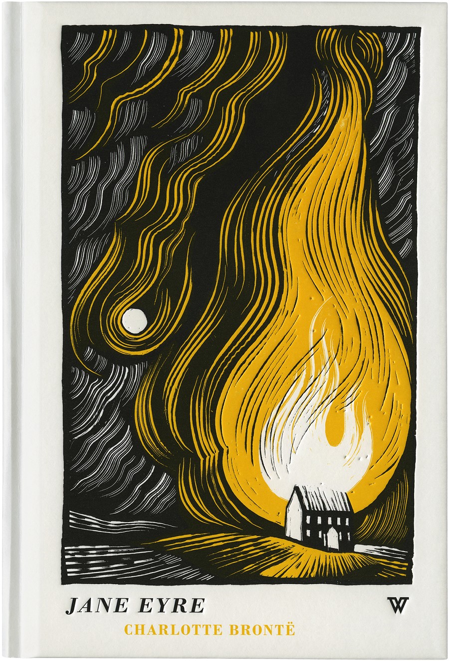
One of my all-time favourite illustrators, Joe McLaren, has designed book covers for Hodder Headline and Portobello, while he also produces handmade picture books. He has designed for a range of gothic classics, including Jane Eyre and Wuthering Heights, and his unique, colour-constrasting designs immediately caught my eye when browsing a bookstore. 


I got in touch with him through email and he was nice enough to reply, to which I was very excited.
 
1: Due to the recent rise in digital publishing do you think the physical book is losing popularity?
In a way, that's probably true, but I'd rephrase it. I think it isn't losing popularity as much as it's losing proliferation. There will, inevitably, be fewer physical books around in the future, but that will mean that the ones that are produced will be more highly prized. The same is true of the horse- there were far more horses around 100 years ago; it was the only way to move stuff around. There are now far fewer horses, but those that are about are kept in relative luxury and highly prized as expensive, desirable commodities. The book, like the horse and the Polaroid camera will find a new, more select audience more interested in essence than utility.


2: How does this affect your design? Does it influence your approach to designing the physical book?
Around half of the commissions I receive for book cover design now are for 'luxury hardback' editions of previously published books. Typically these will be bought as gifts, or by people who have a great fondness for the book in question and want to dignify it with a special purchase. Those commissions tend to revel in textures, materials and processes associated with 'traditional' book design- foil printing, registers, belly-bands etc;  all of which fetishise the book as an object, and none of which really serve the content in a physical way. This suits me- I resonate with tradition, and find that it often gives the greatest scope for playfulness in a subtle way. I also understand the concept of wanting to house a precious book in a precious case. That said, I reacted with initial hostility to the appearance of the eBook- I have a house full of thousands of books, and I suppose I felt in some way that I had an emotional investment in physical literature that I didn't want to see threatened, but that's nonsense. Ebooks are here to stay, and for the most part, that's an excellent thing. More people will read more things, and people can self-publish with far less difficulty and financial risk, which I think is a fine thing. It may mean that book illustration as an industry wanes, but then it always has waned and waxed- for hundreds of years.


3: Would you find digital books more limiting to design for?
Yes, and that's fine. It's a mistake to think of limitations on design as a bad thing. My creativity is always excited most by a very restrictive brief. An 'L' shaped illustration for an article about incontinence that needs to be both amusing and sympathetic, and needs to go to print at 3pm today is a far more demanding and exciting brief to me than an illustration about 'love' with no direction that can be done any time before Christmas. Where would you start? On the other hand, any limitations imposed by digital books will be outweighed by new freedoms and possibilities. I'm already having to engage with briefs that demand illustrations that move slightly, almost unnoticed. Imagine reading a horror story on an iPad late at night, and suddenly the curtain in a small illustration which you've barely looked at for the last three minutes flutters in the wind quite unexpectedly- wonderful stuff!


4: In contrast to the digital copy, a book is 3D. Do you use this to your advantage in your design?
It's always a consideration- particularly in the field of luxury hardbacks. If you want customers to choose such a book over an eBook, then you need to play up all the things which an eBook can't offer- the paper needs to smell good, the cover  can  be debossed and foiled, it should crack open satisfyingly when you first open it. Having said that, I think a Kindle is an equally nourishing thing aesthetically.


5: Are you interested in the gothic genre of literature? Do you find it an interesting genre to design for?
It certainly chimes with my personal tastes- I have a great appetite for horror and anything Victorian in particular. In a way it can be very difficult to illustrate for something you already feel very attached to. I'm currently illustrating covers for a series of fantasy books I've loved since childhood and it's tremendously difficult to actually make decisions and self-edit with material that feels so close to you, in much the same way that it's easier to draw a caricature of your teacher than of yourself- you've lost the necessary objectivity needed to simplify the information.


6: Do you think your individual techniques and the medium you use compliment the Gothic genre?
I often play with imagery and techniques which reference the past, and I often use techniques which necessarily produce stark contrast of light and darkness- all of which finds sympathy in Gothic literature I suppose.


7: How do you transfer your illustrations to a graphical format? Do you think any effect is lost through this?
I always start a piece of work with the final product in mind. Drawings and other physical artwork do lose something when scanned into a computer, but they gain something new at the other end of the process. I typically use scraperboard, which gives high contrast and very clear lines. Digitising the image actually serves to improve those qualities. There is something more intangible lost when you make a physical object into a digital file, but illustration is concerned with communication and the image itself, not the preciousness of the original- that's a concept that belongs to fine art.


8: Does designing a cover for a classic book have its drawbacks?
You have a set of presumptions to counter, but the advantages outweigh this- you can be more oblique and playful with a book everyone thinks they know.


9: How do you use your design to interest the modern audience in a classic book?
The challenge is to interpret something very familiar and established for an audience who is familiar with it. I try and find some aspect of the atmosphere of the book, and hint at the story obliquely, which flatters a certain audience I think.


10: Do you always read the book you're designing for?
Yes, whenever the manuscript is available. Very occasionally the book is unfinished when I create the cover. I usually find an unabridged audiobook, which means I can get through it while running or washing up. I also use a computer programme which converts PDF manuscripts into audiobooks. These sound a bit robotic as you might imagine, but I simply wouldn't have time to get through every book for every cover otherwise. I would hate to be an author and to think that the person who is going to represent my life's work to the customer hasn't even bothered to read it himself.


11: Do you have an agent who helps you find work for book design?
No, not at the moment. I get work through word of mouth, and from people who have seen other covers I have done.


12: Wuthering Heights and Jane Eyre are a very famous stories. Did you find it difficult to break the expectations people could have of these books and how their design should look? How did this affect your design?
Other than bearing in mind that the audience will have a level of familiarity with the title, if not the story, I find it best to treat illustrating them like any other book. Trying to respond in some way to hundreds of years of established ideas about those books would be impossible- better to ignore it, and hope that works!

---

I have highlighted sections that deal particularly with the physical book and the ebook. I found Joe McLaren's insight extremely interesting. He made it clear that, to make the most of the physical book, designers should revel in textures: "foil printing, registers, belly-bands etc;  all of which fetishise the book as an object, and none of which really serve the content in a physical way", while he also said that ebooks were not necessarily a bad thing, as they encourage more people to read. 

Saturday, 19 October 2013

Texture & Morgan Swain

Texture can also play into making the most of the physical book. For example, spot gloss can enhance a particular part of your design - and perhaps the shininess would attract the viewer! The physical book can be picked up and handled, so designers can make the most of that by introducing textures into their designs, encouraging the viewer to pick up the book for a closer look and feel.
 
Morgan Swain's suggested redesigns for classic Roald Dahl books reconfirm this theory. She makes use of the book's cover by giving them the appearance of a physical object. George's Marvellous Medicine looks like a medicine container, with the introduction of a prescription label and the shiny, green texture of a plastic bottle. This texture particularly stands out to me from Swain's collection. The book is so glossy that it catches the light and shines. Already I want to hold the book, to work out its texture and what technique has been used to achieve this appearance. The hand-drawn typography across the label also adds a carefree stroke to the cover.
James and the Giant Peach, meanwhile, resembles the appearance of – you've guessed it – a peach! The orange and gold colouring of the cover adds a fuzzy texture that neatly resembles that of a peach. I could find no further information regarding how these books have been produced and have to wonder if a texture has been used or if the peach colouring is in fact matt. It seems to me that when you hold it the book it would be as fuzzy as a peach. However, I can see that a spot gloss has been used to reinforce the appearance of the peaches' label, cleverly converted to display the title of the book and the author's name. Without this glossy label, the book was certainly appear less like the peach it is trying to mimic.

The next book, Charlie and the Chocolate Factory, seems to be the one with least texture being used, though the shadows of the chocolate wrapper almost give the appearance of a book jacket. I think that could be a wonderful idea – remove the jagged chocolate wrapping book jacket to perhaps reveal the golden ticket beneath? Perhaps the designer could have further made use of the physical book by such a technique. However, this design is still utterly enticing. The typography reveals the era in which the book is set, as does the “packaging” of the chocolate bar. 


To conclude, texture is another selling tool that can be used in book design, especially when it comes to the physical copy of the book. These designs would not be nearly as impressive seen on a screen, for you wouldn't be able to pick them up to feel their unusual textures. 


References: 

Richie Stewart - Edgar Allen Poe Redesign

Graphic Designer, Richie Stewart, suggested redesigned book covers for the classic poems of Edgar Allen Po. 
Stewart explains, “I wanted the design to reflect his tongue-in-cheek way with words. His themes were very dark and at sometimes too morbid to even read, but he always had a way of conveying them in an almost whimsical, comedic fashion.”

His book covers work with strong concepts and bold, graphical imagery, which immediately grabs the attention of the viewer. I would purchase these books in a heartbeat.

What I also found interesting was the unique presentation of these books, seen below:
Obviously, wrapping a belt around a selection of books – or even one book – could prove to be a very expensive and strange advertising method! However, I did really like the idea of attaching a label to book, or a collection of books, especially if it is to display the collection's name. The label Stewart has designed adds a further level of sophistication to his book covers. The simplistic use of typography, minimal colour scheme and bold image stops the label from shadowing the book covers. It merely adds that extra layer of class and good design. Who wouldn't want to be a book when it has been presented so beautifully, with so much unique consideration being put in place? 


References: 

Monday, 14 October 2013

A Talk With Jane Ray

I attended a talk in which author and illustrator, Jane Ray, spoke of her practice, interests and typical working day.
Jane was particularly interested in mythology, patterns and colour. Her work appears intricate and decorative, while she works in the medium of paint and sometimes collage.
As an illustrator and author, I was especially interested in what she would make of the physical vs. digital argument. When asked, she started off by saying that she thought ebooks were “amazing”. She liked how the book covers glow on the ebook screen and how they now can be seen as a coloured image too.

When asked if ebooks affect the way she produces her work, she said no and explained that she does not work on the computer. Her media would not be affected by the ebook; she would work in exactly the same fashion, using paints and sometimes collage. 
She went on to say that she thought ebooks were “fascinating” and that she did not think they presented a threat to the physical book. She said that people will begin to see the physical copy of the book as perhaps more beautiful, as people value print, and perhaps that will also make the sales of the physical copy rise.

She finished the question by saying that she thought the two “could exist happily together”.

Sunday, 13 October 2013

Time Management


Since I have lectures on Tuesday and Thursday, I have decided to make Wednesday my day for focusing on my Independent Study and Friday the day for my Negotiated Production module. I should be doing about seven hours a week on both of these modules and plan to put in the majority of these hours on the set days. However, I can also use the weekend or Monday to add in extra hours, if needed.

Wednesday, 9 October 2013

3D Book Covers


An offshoot publisher for Random House, Vintage Books, released five new book covers for classic sci-fi and horror novels. What attracted me to these books was how unique and innovative they were. For these books have anaglyphic 3D covers and, included inside the book, come with a pair of 3D glasses. Apparently 3D isn't just for TVs.


Suzanne Dean, Random House's creative director, said, “The 3D cover is an idea I thought of a long while ago and had been holding onto until the right book came along. This sci-fi project, with all its B-movie connotations, was the perfect match.”

The five books that were redesigned were:

Planet of the Apes by Pierre Boulle. This was designed by Mick Brownfield, an illustrator who works in advertising, editorial and publishing, as well as being an avid comic-collector, something that is reflected in his work. 

Twenty Thousand Leagues Under the Sea and Journey to the Centre of the Earth by Jules Verne, designed by – no surprise here – Jim Tierney.


The Lost World by Arthur Conan Doyle, designed by Sara Ogilvie, an illustrator who studied illustration and print-making. Her illustrative work is feminine, with loose, scratchy lines. It was therefore interesting to see her design for The Lost World, which is bolder and stronger.


The Call of Cthulhu and Other Weird Tales by HP Lovecraft, designed by Vladimir Zimakov. Line-work is extremely prominent in his illustrations, making him perfect for this job. It is also interesting to see him adding colour in this book design, for he usually works in monochrome.

These illustrators were apparently chosen due to their graphic style and defined line-work. Suzanne Dean thought that their work would, “Translate well to a 3D illustration, yet hold together without the use of 3D glasses.”

These illustrators were given guides on how to create a 3D image, on how creating a 3D image relies on the position of the red to the blue tones. This added an extra layer to what the illustrators had to consider when it came to creating these designs. But with their splashes of colour and eye-popping typography, these covers work wonderfully without the 3D glasses also. Indeed, the design for Planet of the Apes certainly caught my eye when browsing my local Waterstones.

The inclusion of 3D glasses is such a fun idea, aiming perhaps to bring a classic tale into the modern era. Again, I knew this would not work on the ebook so was fascinated with seeings the creative experiments of making the most of the physical book. I feel that this design is really encouraging people to pick up the physical copy instead of the digital one.

References: 
http://www.digitalartsonline.co.uk/news/illustration/designing-3d-covers-for-random-houses-new-vintage-line-of-classic-novels/
http://www.creativereview.co.uk/cr-blog/2011/may/vintage-3d-covers
http://www.geek.com/geek-cetera/classic-sci-fi-novels-get-re-released-with-3d-covers-1354795/ 
http://www.vladimirzimakov.com/
http://www.jimtierneyart.com
http://www.saraogilvie.com/
http://www.mickbrownfield.com/